
Services › Communications
Don’t bore people.
Give them your story through clean, uncluttered design that actually communicates.
Give them your story through clean, uncluttered design that actually communicates.
Corporate communications is where most companies go on autopilot. The brochure looks like everyone else's. The invite goes straight to the trash. The catalog is technically accurate and completely forgettable.
It doesn't have to be that way. Good corporate communications requires three things: a clear message, a design that doesn't fight it, and enough creativity to make someone actually want to read it.
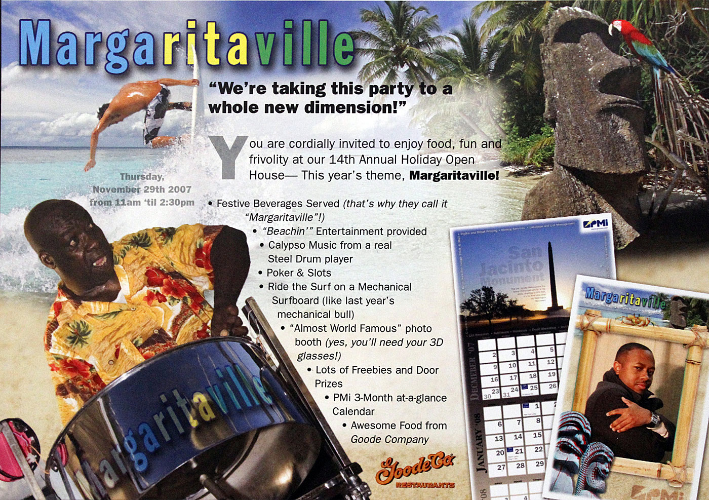
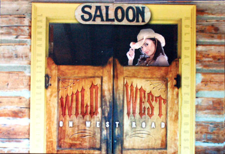
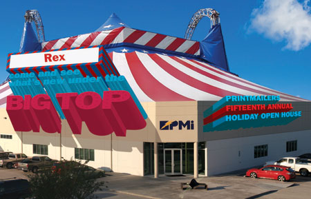
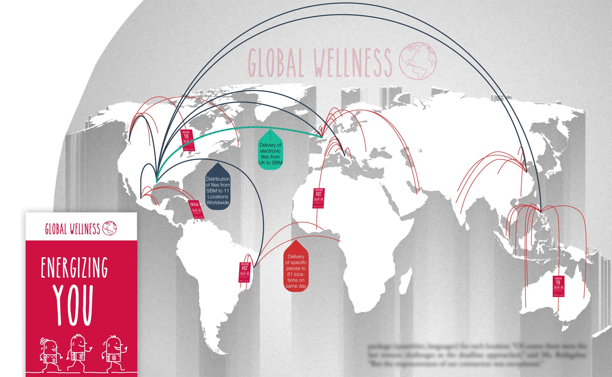
I've produced open house campaigns that people kept on their desks. One piece - a variable data postcard with a scratch-off element and a Las Vegas theme - won a national award from the National Direct Mail Association. Another used 3D glasses and variable printing - the only piece of its kind ever produced using that technique.
The point isn't novelty for its own sake. The point is getting someone to open it, read it, and show up.
An 8-page brochure I art directed, wrote, and photographed for a B2B client became the foundation for their entire sales process. It worked because it was built around what the customer needed to believe before they'd write a check - not around what the company wanted to say about itself.
That's the difference. I write these things, not just design them. Copy and design handled in-house means the message and the look actually match.
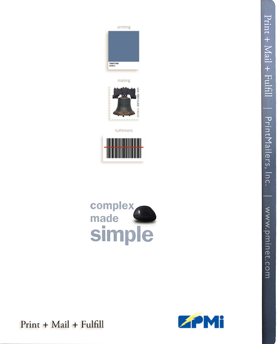
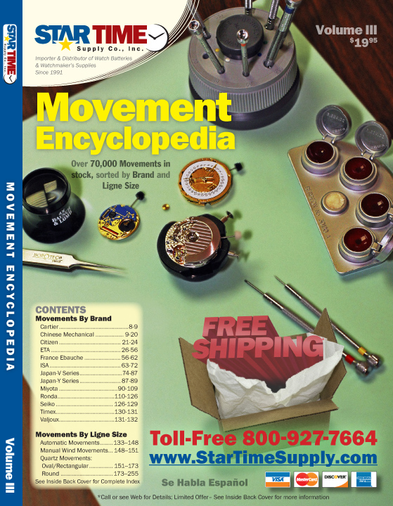
Complex technical data doesn't have to look like a government form. I've produced 16-24 page technical catalogs for industrial clients where the challenge was making dense specs readable without dumbing anything down. Precision and clarity aren't opposites.
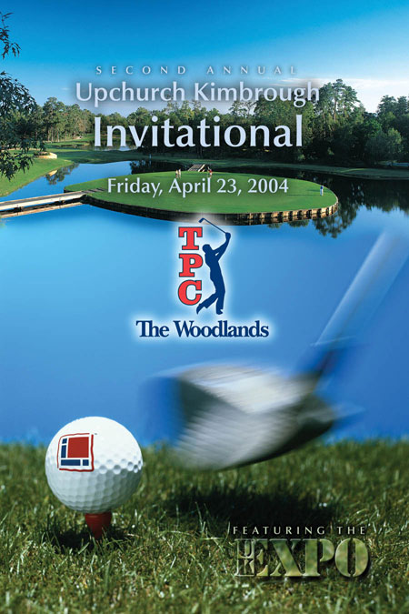
When something happens worth announcing, the announcement should match the moment. Mergers, anniversaries, new locations, new leadership - these deserve more than a boilerplate template. I write and design announcements that actually get read.


15 minutes, free, no pitch. Tell me what you're trying to communicate and who needs to hear it.
Book a free call